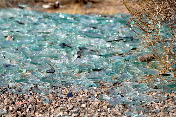
Anyone who has walked our desert knows that broken glass is something you see every day. I originally set out to photograph a Joshua tree but on my adventure back I spotted this pile of glass. Now normally I would have just walked by, but since I was looking for ordinary objects to become more extraordinary I thought the glass might be fun to photography. When looking at the glass through the lens I began to see the glass in a different form, my daughter thought it was beautiful and my son thought it was jewels here is what I got…
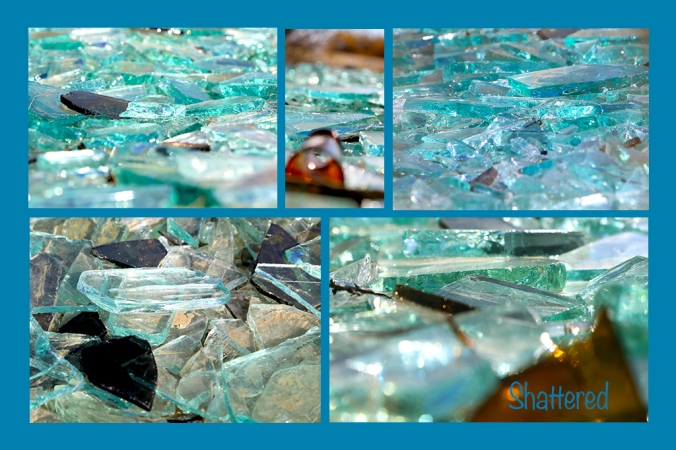
Collage of Broken Glass

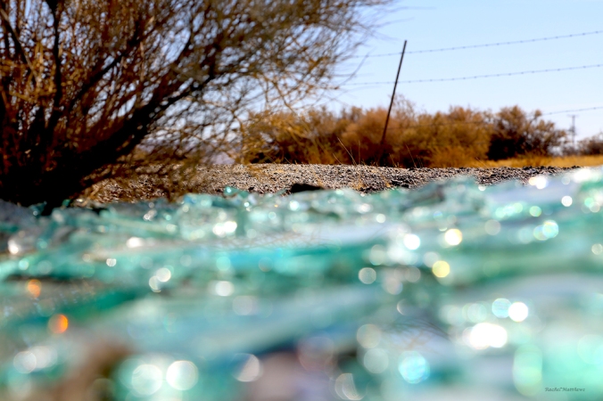
Took this shot because you could see the sage bush in the reflection of the glass.
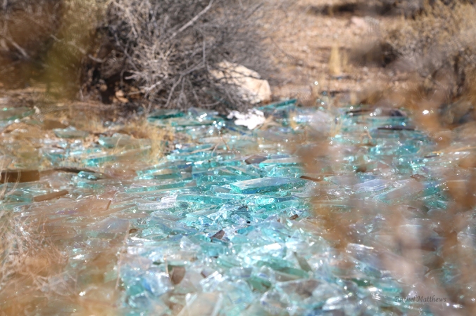
Close up shot from the south.
Shot taken down on ground, trying to find a new perspective.
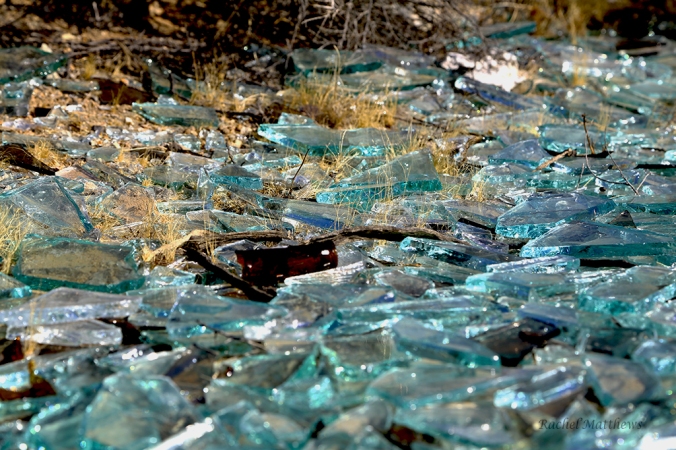
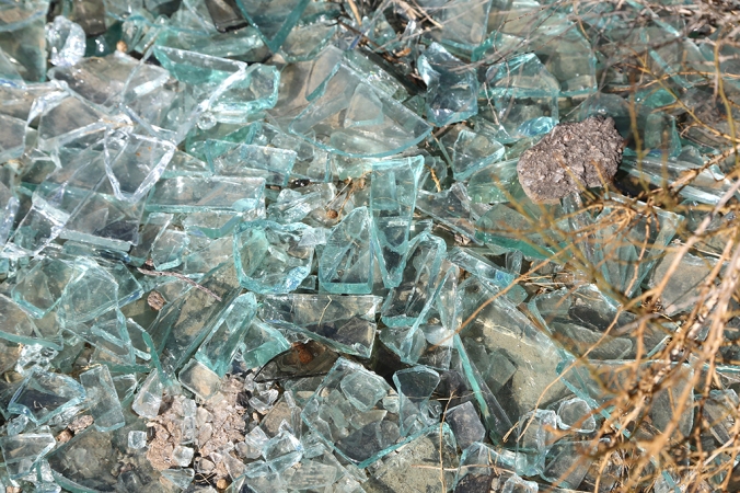
Taken at the North East angle where I spotted a cool broken bottle top
Using a different focus taken from the North side.
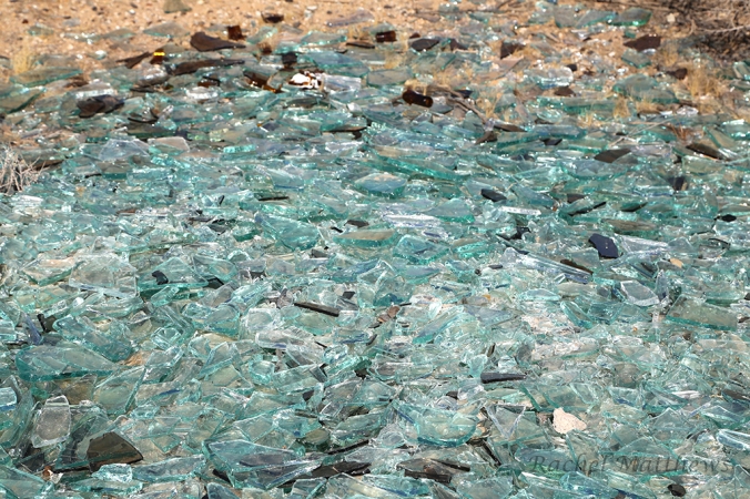
How the glass appeared as I first approached it.
Shot taken from the East side of the glass

This is the blended picture, where I took one picture and laid it over the top of another picture and with the tips from Sister Esplin’s book I was able to blend the two pictures together to make one.
Process: I really enjoyed taking these photos. It was a lot of fun laying on the ground, metering the light, and zooming in on different pieces of glass and focusing on different aspects as well. After I was done shooting from different angles, I took my photos to Adobe Photoshop CS6 Were I edited them. Since this program was fairly new to me I kept my edits simple. I increased my exposure, vibrancy, and on a few of my photos I increased the saturation. I also adjusted the brightness and darkness of the photos to help keep the brightness of the glass or darkness of the glass bottle. I then created my blended photo which was a challenge at first but Sister Esplin’s steps really helped my overlay the pictures and find fun ways to blend my photos. I blended my photos with the color burn, changed the opacity to 70% on the top photo and lightened it up. If you look closely you can see glass pieces in the sage bush. Then I created a college where I added my favorite shots after editing was complete and I did a clipping mass to fit my photos into my rectangle shape.
Critique: I critiqued Lani Wong and Connie Willard’s collages. Lisa Smith, Savanah Raymond-Burke, Connie Shirley, and my instructor critiqued me. I was advised to change the typography because it was hard to read, change the background color and correct spacing between images. I took the advice that was given to me and made changes to my college. I changed the background color to match the blue from one of the glass pieces, I changed the font from decorative to San Serif, and I corrected the spacing between the images.
Font: Noteworthy (San Serif)